You might be exhausted after all the research planning, coordination, and facilitation. You’ve got the data, but now comes the part where you have to figure out what it all means.
Data analysis or sensemaking of the UX research process often feels the most daunting. This process can take as much time, if not more than conducting the research itself. You’re looking at hours of recordings, data cleaning, piles of notes, stakeholder debriefs, and spreadsheets packed with responses or coded observations.
In this article, we walk through key steps and mindset shifts that can help lighten the load and make the data analysis process feel more manageable whether its thematic analysis for qualitative research or drawing statistical significance from quantitative data.
Translate raw data to real impact with Hubble
Request a Demo
Why Sensemaking Feels Hard
There’s a reason this phase trips people up. After all the effort spent fine-tuning the research plan, facilitating sessions, data collection, and taking detailed notes, you’re left with a mountain of raw data. And comes the human part of navigating ambiguity, interpreting what it all means, deciding which threads are worth pulling, and staying focused on the bigger picture.
One challenge is the sheer volume of data, and how much time it really takes to process. More time than anyone ever budgets for. Sifting through transcripts, rewatching recordings, organizing notes into something useful. It’s slow, demanding work. When deadlines are tight and the pressure to deliver meaningful insights is high, it can feel overwhelming.
.png)
Sometimes you’ll come across contradicting data, or moments where the data feels too scattered to reveal any clear patterns. Moreover, different researchers or stakeholders might walk away with entirely different interpretations.
You might second-guess what’s important or worry about what you’re missing. That’s normal. The uncertainty isn’t a sign that you’re doing it wrong. It’s a sign that you’re doing the real work of synthesis.
UX researchers develop expertise and routines over time to make the analysis process more manageable. However, there’s no golden standard to follow as learning goals, project scope, and business context vary from project to project.
Finding a Process That Works
While there’s no universal template that works for every research project, you can still define a loose structure that helps you get started with analyzing UX data. Having a go-to process gives you something to lean on when things feel fuzzy. It's not meant to be prescriptive, but rather a flexible starting point you can adapt to fit the needs of each project.
1. Revisit the Research Goals
Before jumping into tagging quotes or organizing stickies, take a step-back and revisit why you did this research in the first place. It’s easy to get lost in the massive volume of data and start chasing interesting side threads.
Go back to your original research questions and prioritize what you want to learn:
- What are you trying to learn?
- What decisions does this research need to inform?
- Who needs to act on the findings?
As the researcher, you should have a clear reason for why each piece of data was collected and understand how it maps back to your research questions. Revisiting those key questions helps you set your intention and gives you something to push against when the data starts pulling you in a dozen different directions.
Framing your synthesis around the original questions also keeps your audience in mind. What you share with a product manager may be very different from what matters to a designer or an engineer.
2. Brain Dump, Pre-process Data, and Organize Your Data in One Place
Once you’ve reconnected with your research goals, the next step is to gather everything into one place. That includes notes, session observations, stakeholder comments, and even insights that might connect back to previous research. The goal is to make the data accessible and easy to view, so you’re not jumping between scattered files or formats.
If you’re working with spreadsheets or survey responses involving quantitative UX data, you’ll likely need to do some preprocessing, which involves cleaning up unnecessary columns, data formatting, or reshaping the data, so you’re working with a simplified, usable dataset.
The point of this phase is to unload, not organize. Don’t worry about grouping things into themes or identifying patterns just yet. The goal is to externalize what stuck with you, what surprised you, what came up more than once, what moments felt emotional, stressful, or like an aha? This could mean typing out standout quotes, copying rough notes into a whiteboard, or scribbling next steps in the margins.
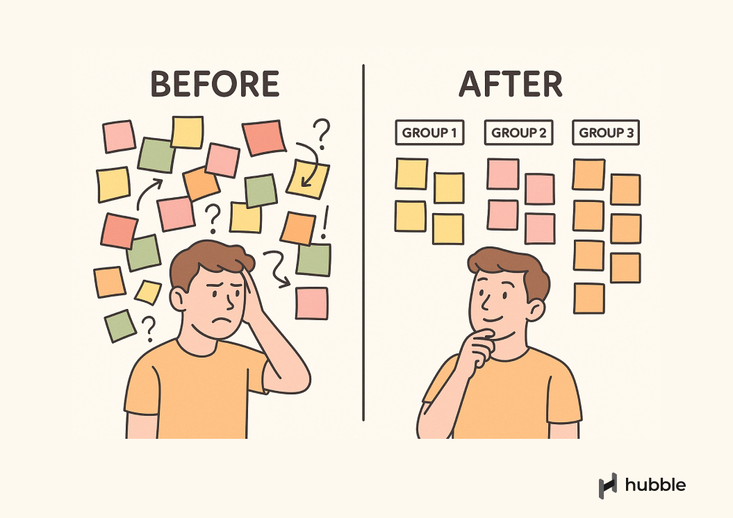
3. Affinity Mapping and Clustering
Even the initial step of cleaning and organizing your data can take significant time, depending on the scope of your project and the research methods used. For example, conducting in-depth user interviews or usability testing often results in hours of recordings, transcripts, and behavior data packed with rich qualitative data that still needs to be unpacked.
This is where the real work begins as you start looking for connections: Identifying trends, recurring behaviors, places where users get stuck, and moments that were unexpected or emotionally charged.
Depending on your dataset, you might need to distill the information in stages by user segments, platform types, or other filters. Let patterns surface naturally by grouping related quotes, observations, or behaviors together.
Analyzing Qualitative Data
If you’re working with qualitative data, a virtual whiteboard can be incredibly useful. Tools like FigJam, Mural, or video analysis with note-taking capabilities allow you to move things around freely, spot overlaps, and explore different ways of seeing the data. The key is to make the process visual and collaborative.
Categorizing data to clusters is often time-consuming and a bit chaotic. You’ll run into sticky notes that could live in two places or data points that don’t seem connected until they suddenly are. Some themes will come together quickly, while others may need to simmer for a bit before they make sense. As you work, stay curious and avoid jumping to conclusions too early.
To learn more, check out our guide to affinity maps and thematic analysis, where we break down the process of analyzing qualitative data analysis.
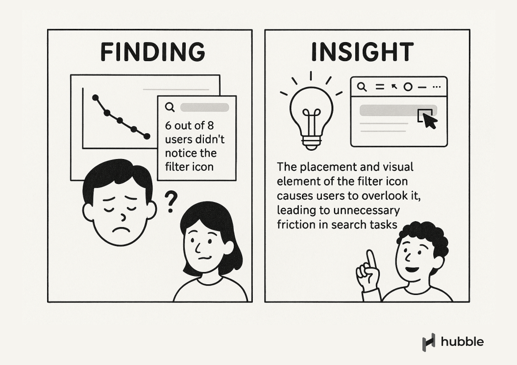
4. From Observations to Insights
As you work through the data, certain patterns will start to take shape. Some clusters will stand out. User behaviors will repeat. Frustrations will echo across sessions. This is the point where you begin shifting from all your raw data to relevant insights.
Observations tell you how users interact or what happened. Insights tell you what it means and why it matters. For example:
- Observation: Users hesitated on the pricing page.
Insight: They couldn’t figure out what they were paying for. - Observation: 5 out of 9 participants missed the button.
Insight: The button doesn’t communicate its purpose clearly in the context of the flow.
Sometimes a single quote or moment can be enough to capture the essence of an insight. Other times, it’s the repeated behavior across multiple sessions that makes the story clear. Be sure to ground your takeaways in the data, but don’t be afraid to draw conclusions. That’s part of the job.
5. Prioritize What Matters
Often, you’ll end up with multiple themes, each backed by strong quotes, clear behaviors, and solid observations. Not every key finding is immediately relevant. Some themes might be useful later but aren’t urgent right now.
To help decide what deserves attention, here are a few practical criteria you can use:
- Frequency: How often did this behavior or user feedback come up?
- Severity: How much did it impact the user’s ability to complete a task or reach a goal?
- Impact: If addressed, how much would this improve the user experience or product outcome?
- Confidence: How consistently is this theme supported across sessions or data sources?
- Strategic relevance: How relevant is this insight with current product or business priorities?
Once you've evaluated your themes using these criteria, start organizing them into buckets:
- High-impact, high-confidence insights that should inform immediate decisions
- Quick wins or low-effort fixes worth flagging for short-term improvements
- Contextual findings that are good to document but don’t require action right now
This process is not throwing away anything, but think of it as making your synthesis more actionable. A long list of themes can overwhelm your audience. A prioritized set gives them direction and clarity. You can always store the rest in an appendix or research repository to revisit later.
6. Translating Themes to Actionable Next Steps
Once you’ve identified themes, the next step is to turn them into artifact that informs decisions.
Start by translating your findings into clear, usable takeaways. This might mean pairing each insight with a recommended next step, a “how might we” statement, or a product consideration. Your job is to help the team move, not hand over a checklist.
Be specific, but stay grounded in user behavior. Instead of saying “Users don’t like the onboarding flow,” say “Users skipped most onboarding steps because they wanted to access the main dashboard as quickly as possible.” This kind of framing makes it easier for product managers and designers to make informed trade-offs.
Insights, on the other hand, are what you make of those findings.
One simple way to make insights actionable is to lead with a verb. For example:
- Insight: Users found the onboarding experience too long and disengaging
- Action: Shorten and simplify the onboarding to help users reach core value faster
Always pair insights with supporting materials, such as quotes, screenshots, or short video clips, as they add context and emotional weight to the findings.
Also consider your deliverable format. Depending on the research method and learning goals, the type of data collected will shape the form your insights should take. It might be a short Slack write-up, a prioritization board, a journey map, or a slide deck. The right deliverable is the one that helps your audience absorb and act on the insights.
We recommend our article on different UX deliverables to maximize research impact.
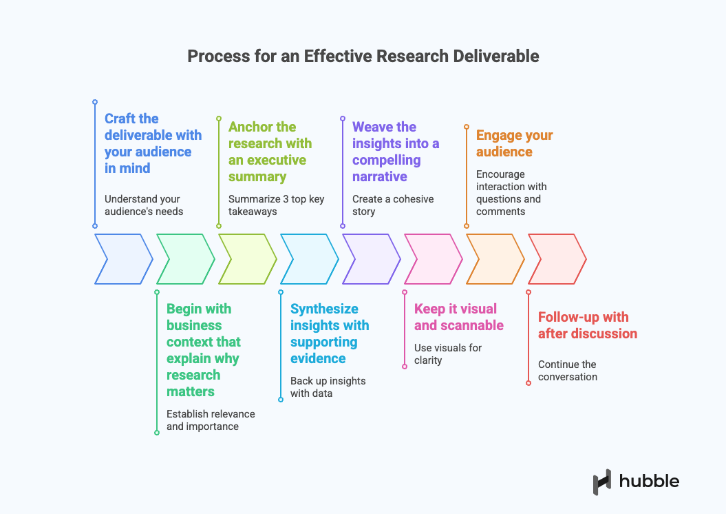
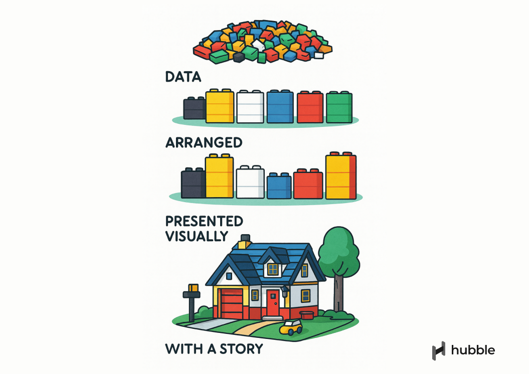
7. Presenting Your UX Deliverable
A strong UX deliverable doesn’t just summarize findings. It tells a story. It connects the dots between what users said, what they struggled with, and what your team can do about it. Your job isn’t just to report, but it's to communicate in a way that moves the conversation forward.
If your study includes quantitative research and UX metrics benchmarking (e.g., task success rate, time on task, etc), focus on telling the story behind the numerical data instead of emphasizing statistical significance or technical details that may not resonate with your audience.
Choose the right format for your audience. A product manager might prefer a concise slide deck with themes, implications, and next steps. A designer might want to walk through sticky notes and prototypes. An engineer might appreciate clear behavioral evidence linked to specific flows. Don’t assume one format fits all.
And most importantly: leave space for discussion. A good readout isn’t a monologue. Instead, invite questions and let the team poke at the findings as group discussion will strengthen alignment across different team members.
Qualitative and Quantitative data to Meaningful Insights
Making sense of quantitative and qualitative data is rarely clean, fast, or easy. It’s a process that asks for patience, curiosity, and a willingness to sit in the messy middle. But it’s also where some of the most meaningful work happens where scattered observations turn into actionable insights.
Finding a rhythm and workflow that works for you is important because every user research project brings its own nuances, constraints, and paths through the UX analysis process. The goal isn’t to follow the same checklist every time, but to focus on what helps your team better understand your users and make more informed decisions. At the end of the day, it’s about building shared understanding and giving your team the clarity to move forward with confidence.
Translate raw data to real impact with Hubble
Request a Demo
FAQs


Observations describe what happened during your sessions: what users said or did. Insights go a step further by interpreting why it happened and what it means for the product or experience. Turning observations into insights is a key part of sensemaking.
No. Including everything can dilute your message. Focus on the most relevant and actionable insights. It's better to be clear and directional than exhaustive. You can keep additional findings in backup slides or a repository.
Use criteria like frequency, severity, impact, confidence, and strategic relevance. Focus on what aligns with your research goals and supports immediate product decisions. The rest can be documented in an appendix or repository for future use.
Invite them to early synthesis sessions, share raw observations or quotes in Slack, or run collaborative workshops. Getting others involved helps build shared understanding and makes your research more impactful across the team.