Qualitative data captures the thoughts, feelings, behaviors, and motivations behind how people interact with a product. Unlike quantitative data, which focuses on numerical trends and statistical significance, qualitative research helps researchers understand the why behind user behavior and decision-making.
In this article, we introduce thematic analysis and affinity mapping, and explain how each approach helps researchers make sense of complex data, identify meaningful patterns, and synthesize user-driven insights that can inform product and design decisions.

What qualitative data looks like in practice
Qualitative research focuses on understanding the underlying whys and hows behind behaviors, which means it often relies on smaller sample sizes, typically fewer than 20 participants. Even analyzing in-depth interviews with 10 or more participants can quickly become daunting. Rather than aiming for statistical significance, qualitative studies generate text based data that captures people’s experiences, perceptions, and reasoning in their own words.
In user research, this type of data is commonly collected through methods that allow participants to explain their experiences in depth, such as interviews, open ended surveys, and observational studies. These methods produce rich but unstructured data that requires careful analysis to surface patterns and key insights.
Common research methods:
- Interviews: One-on-one conversations that help researchers understand customers' perspectives, experiences, and attitudes in depth.
- Focus groups: Group discussions that reveal shared beliefs, disagreements, and social dynamics through participant interaction.
- Observations: Direct observation of people in natural or controlled settings to understand real world behaviors and interactions.
- Surveys with open-ended questions: Open-text responses that allow customers to describe their thoughts and experiences in their own words.
- Diary studies: Ongoing reflections recorded by users over time, offering longitudinal data.
Common challenges when analyzing qualitative data
While these research methods yield rich insights, they also produce large volumes of unstructured data. Without a clear and systematic approach, identifying meaningful patterns across responses can quickly become difficult.
High volume and complexity
One of the primary challenges in qualitative analysis is the sheer volume and complexity of the data. Unlike quantitative data, which is structured and numerical, qualitative data often consists of long transcripts, notes, or recordings. Reviewing and organizing this information requires significant time and sustained attention, making it easy to feel overwhelmed as the dataset grows.
Subjective interpretation
Another challenge lies in the subjective nature of qualitative analysis. Interpreting text involves making sense of individuals’ thoughts, emotions, and experiences, which can vary widely from person to person. What one researcher finds important may feel far less relevant to a product manager or non-designer, leading to differences in interpretation.
Researchers also bring their own assumptions and biases into the analysis process, which can shape how research findings are framed. One practical way to reduce subjectivity is to involve multiple team members in the analysis and collaboratively identify recurring and conspicuous themes.
Superficial insights that lack depth
There is also a risk of analysis becoming a simple regurgitation of data. This often happens when researchers rely too heavily on memorable quotes or surface level observations without exploring underlying patterns. When analysis lacks depth, the resulting insights may fail to meaningfully inform design or product decisions.
Saturated and contradicting data
Qualitative research often reaches a point where additional data no longer reveals new insights. Even studies with fewer than ten participants can generate a large amount of overlapping information. At the same time, smaller sample sizes make it more likely to encounter contradictory perspectives across participants.
Managing conflicting data requires careful interpretation to understand why differences exist and how they relate to broader patterns. Without a structured approach, it can be difficult to determine which findings are meaningful and which are outliers.
Understanding thematic analysis
Analyzing qualitative data offers deep insight into users’ experiences, but it comes at the cost of time and effort. Because qualitative data is broad, nuanced, and unstructured, researchers need an organized approach to make sense of it. This is where thematic analysis plays a critical role, offering a systematic approach to organizing data, identifying meaningful patterns, and developing recurring themes within textual data.
Thematic analysis is a method for identifying, analyzing, and reporting patterns or themes within qualitative data. It involves systematically coding and organizing data to surface recurring concepts that capture key aspects of users’ experiences, perspectives, or behaviors.
.png)
In practice, thematic analysis can be approached in different ways depending on the goals of the study. A deductive approach is often used when researchers begin with predefined assumptions, research questions, or hypotheses established during the planning stage. In this case, analysis focuses on examining the data through those existing lenses to validate or challenge what is already expected.
In contrast, an inductive approach allows themes to emerge directly from the data without predefined expectations. This approach is commonly used in exploratory research, where the goal is to uncover new insights rather than confirm existing assumptions.
Inductive and deductive approach
In practice, qualitative analysis rarely requires choosing strictly between an inductive or deductive approach. There is no single correct method, and most user research projects benefit from a combination of both.
A deductive approach, guided by predefined design questions or hypotheses, provides helpful structure when working through large volumes of qualitative data. It gives researchers a clear lens for interpreting responses and assessing whether initial assumptions hold true.
At the same time, new themes often emerge that were not anticipated during planning. User research is not bound by the same constraints as academic research, and hypotheses do not always need to be fully defined in advance. These unexpected patterns can surface some of the most valuable insights, especially in exploratory studies.
Coding in qualitative research
Coding is a foundational step in qualitative analysis and a core part of thematic analysis. While the term may sound technical, coding in qualitative research has nothing to do with writing code in programming languages.
Instead, coding refers to the practice of labeling segments of qualitative data to help researchers make sense of what customers are saying. These labels are applied to interview transcripts, observation notes, or open ended survey responses based on their content, meaning, or relevance. Over time, patterns begin to emerge as similar codes are applied across multiple data points.
At a high level, there are two common approaches to labeling or coding qualitative data: descriptive and interpretive coding. While they serve different purposes, they are often used together as part of an iterative analysis process.
Descriptive Coding
Descriptive coding is typically used in the early stages of analysis. Labels are assigned based on surface level characteristics or explicit content in the data, without adding interpretation or inference. These codes aim to capture what was said or observed as clearly and succinctly as possible.
This approach helps researchers systematically organize and categorize large volumes of data, laying the groundwork for deeper analysis later on.
Interpretive Coding
Interpretive coding builds on descriptive coding by examining the underlying meaning, context, and implications of the data. Rather than focusing solely on what was said, this approach explores why it matters and how it connects to broader theme or research goals.
Examples of descriptive and interpretive coding
Sample P1: “I know the feature exists, but I am not sure when I am supposed to use it.”
Sample P2: “The pricing feels fair, but I am worried it will increase later.”
Like the examples above, descriptive codes focus on what customers say or do, while interpretive codes explore why those behaviors matter and how they connect to broader patterns. Interpretive coding involves a higher level of abstraction and inference, as researchers analyze relationships across codes and consider them within the broader context of the study.
A systematic approach to analyzing qualitative data
Analyzing qualitative data can pose challenges, particularly when subjective interpretation is necessary, especially when handling large volumes of data. However, employing a systematic framework that integrates thematic analysis, deductive reasoning, and coding techniques can greatly enhance the efficacy of qualitative data analysis.
- Thematic analysis provides a structured approach to identifying patterns and themes within the data.
- Deductive reasoning allows you to test existing theories or hypotheses against the data, providing a framework for interpretation.
- Systematic coding practice helps you better organize and categorize information, facilitating the identification of key themes and insights.
Affinity mapping as a visual synthesis technique
Affinity mapping, sometimes referred to as affinity diagramming, is a visual synthesis technique used to organize qualitative data by grouping related observations based on similarity. Rather than focusing on detailed interpretation at the individual data point level, affinity mapping helps researchers step back and identify broader patterns across the dataset.
In UX research, affinity mapping is often used alongside thematic analysis. While thematic analysis provides a systematic approach to coding and interpreting data, affinity mapping is a visual representation that offers both visual and collaborative way to cluster those codes, ideas, or observations into meaningful groups and emerging themes.
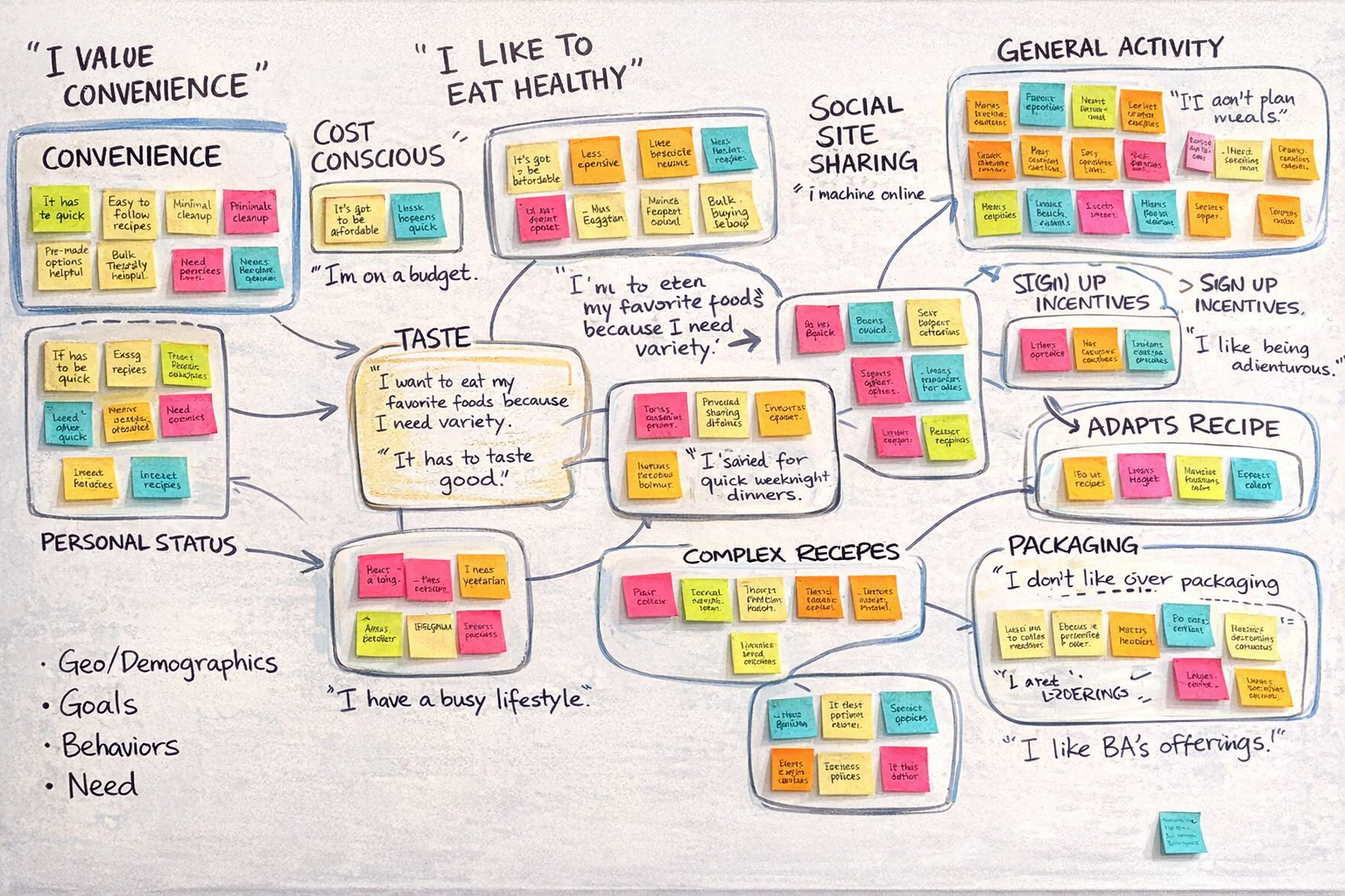
Affinity mapping can be done using physical materials, such as sticky notes on a wall, or digitally using whiteboard tools. Because individual data points are represented as movable units, teams can easily reorganize and discuss clusters together. This shared, visual structure supports collective sense making, helping teams surface key patterns, align on insights, and make more informed product or design decisions.
Together, thematic analysis and affinity mapping help researchers move from individual observations to shared understanding.
How to do affinity mapping
Affinity mapping is most effective once qualitative data has been collected and initially reviewed. The goal is to visually organize observations or coded data so patterns and relationships become easier to see and discuss.
Below is a high level step-by-step for creating affinity diagrams:
- Prepare the data
- Visualize individual data points
- Group related data by similarity
- Review and refine clusters
- Name themes and patterns
- Connect related themes
- Synthesize into a narrative
1. Prepare the data
Break down your research data into individual observations, quotes, or coded snippets. Each piece of data should represent a single idea unit that can be reviewed and moved independently during the mapping process.
If your data is already coded, you can use those coded excerpts directly. If not, pull out relevant observations or verbatim quotes that capture key moments from the research.
2. Visualize individual data points
Place each observation onto a physical or online whiteboard so every data point is visible at once. Virtual sticky notes or digital cards work well because they can be easily rearranged. Consider using different colors to represent each participant.
Using one note per observation helps prevent ideas from being combined too early and allows patterns to emerge more naturally as the data is grouped.
As you arrange and visualize the data, this initial pass helps you develop a sense of the overall content and how different observations relate to one another. Seeing all data points at once makes it easier to recognize emerging patterns before formal grouping begins.
3. Group related data by similarity
Begin arranging data points into clusters based on shared meaning or similar ideas. At this stage, focus on creating affinity groups without worrying about labels or formal themes. This step is intentionally exploratory. Allow clusters to form organically as you compare observations and ideas on sticky notes.
This is also a good stage to involve team members in a collaborative affinity diagram process. Workshops are commonly used to engage stakeholders and build shared understanding around the data.
If the dataset is large, consider assigning experienced colleague to co-facilitate or dividing participants into smaller groups. This approach makes the activity more manageable and allows more people to actively contribute to create an affinity diagram and drive actionable insights.
4. Review and refine clusters
As clusters take shape, revisit and adjust them. Split groups that feel too broad, merge those that overlap, and draw connections when new clusters emerge.
This back and forth refinement is a key part of completing affinity diagrams as it combines individual notes to powerful themes.
5. Name themes and patterns
Once clusters stabilize, assign clear and descriptive labels to each group. These labels should reflect the underlying insight or pattern, not just a surface level topic.
Good theme names help communicate why a cluster matters and make it easier to translate findings into actionable insights.
6. Connect related themes
After naming themes, explore how different clusters relate to one another. Look for supporting relationships, dependencies, contradictions, or tensions across themes.
Connecting themes helps elevate the analysis from isolated insights to a more holistic understanding and provides the foundation for building a clear and compelling narrative later in the research process.
7. Synthesize into a narrative
Finally, translate the clusters and their relationships into a coherent narrative that addresses the original learning objectives. The goal is to tell a clear story grounded in evidence, rather than summarize individual data points.
The affinity map serves as a visual backbone for this narrative, helping teams align on insights and communicate findings effectively to stakeholders.
Tips for effective affinity mapping
Effective affinity diagram is crucial for deriving meaningful insights from qualitative data. Here are some tips to keep in mind:
Affinity mapping is most effective when it goes beyond organizing data and actively supports sense making. The tips below help ensure the entire process leads to actionable research results rather than surface level summaries.
1. Avoid regurgitation of data
Summarizing findings can be useful, but summaries alone do not equal insights. Identifying common pain points is a starting point, not the end goal. Insight emerges when you understand how those factors affect users’ workflows, decisions, or behaviors.
Rather than restating customer verbatim quotes, push the analysis further by examining patterns, relationships, and implications across themes. Ask what is driving the issue, why it matters, and what it reveals about the overall user experience.
2. Interview questions are not themes
Themes should not mirror the structure of your discussion guide or interview questions. Your research deck should not simply walk through questions one by one. Strong themes explain the underlying drivers behind responses, not just how many people gave a particular answer.
Example research question: How intuitive do users feel about the onboarding flow?
- ❌ Don't: "7 out of 10 people found it intuitive."
- This restates the question instead of synthesizing insight
- Lacks context about what felt intuitive or why
- This statement ultimately does not inform design or product decisions
- ✅ Do: "Clear task guidance reduces onboarding friction for new users."
- While 7 out of 10 participants described the onboarding flow as intuitive, their reasoning was consistent. Users felt confident when each step clearly explained what action to take next and why it mattered.
- Participants who hesitated or felt confused often cited moments where instructions were vague or disconnected from their immediate goal.
While grouping responses by question can help with organizing information, it rarely surfaces insights or reveals how ideas connect across the dataset. Strong themes cut across questions, showing relationships and patterns that reflect how users actually experience the product.
Instead, allow themes to emerge from the data itself. Look across responses and identify recurring ideas based on shared meaning, regardless of where they appeared in the interview. This approach keeps the analysis grounded in observed behaviors and experiences.
- ❌ Don't:
- ❌ List out the pain points
- ✅ Do:
- ✅ Narrate how one affects customer workflow
- ✅ What substitutes they leverage
- ✅ How design ideas can address the problem.
3. Support themes with quotes, body language, and facial expressions
Strengthen themes by grounding them in evidence from research, including direct quotes, observed behavior, and nonverbal cues such as pauses, tone, or facial expressions captured during research sessions. These signals help illustrate how customers experienced an issue, not just what they said.
Incorporating behavioral and emotional context adds depth to the analysis and increases credibility, especially when sharing findings with stakeholders who were not present during the sessions.
Incorporate direct quotes and nonverbal cues, like facial expressions captured during user interviews, to vividly illustrate and reinforce your themes. This not only enriches your analysis but also enhances its credibility.
4. Use online tools to support collaborative affinity mapping
Digital whiteboard tools such as Miro, Mural, and FigJam make it easier for teams to collaborate during affinity mapping, especially when working remotely along with affinity diagram templates to easily get started with.
More importantly, online whiteboard tools create a shared space where stakeholders can actively participate in sense making. Involving stakeholders in affinity mapping activity helps surface varied perspectives and reduces the risk of analysis being shaped by a single point of view. Because qualitative data can be interpreted in different ways, collaborative sorting and discussion encourage better team alignment through active discussion.
Affinity mapping workshops often naturally lead into early brainstorming sessions. As teams analyze patterns and discuss insights, design opportunities tend to surface organically.
While this momentum is valuable, it can be more useful to acknowledge these design ideas and plan a dedicated follow up session for ideation. This approach keeps the affinity mapping focused on sense making, while also maintaining team engagement across later stages of the UX process.
5. Prioritize themes that address research questions
Not all themes carry the same weight. While unexpected insights can be valuable, it is important to prioritize themes that directly address the original research questions and objectives.
Keeping the research goals front and center helps maintain focus and ensures the analysis leads to actionable outcomes. Themes that do not clearly contribute to answering the core questions can be documented, but should not distract from the primary narrative.
6. Connect themes into a cohesive narrative
Individual themes become more powerful when they are connected into a coherent story. Rather than presenting themes in isolation, focus on how they interact and influence the big picture.
A strong narrative highlights how pain points affect users’ workflows, decisions, and behaviors, and explains why those issues matter. When themes are woven together thoughtfully, they outline a clear and compelling narrative that helps stakeholders understand the user journey and evaluate potential design directions.
From patterns to decisions
Analyzing qualitative data through thematic analysis and affinity mapping helps researchers move beyond individual observations toward deeper understanding. Thematic analysis provides a structured way to identify patterns, recurring themes, and underlying meaning.
Affinity mapping complements this process by visually laying out all the data and forming a collaborative environment. By organizing ideas into clusters and exploring how one theme relates to other themes, teams can surface connections that may not be immediately obvious when reviewing data in isolation. Together, these approaches offer a practical and systematic way to make sense of complex qualitative data.
FAQs


Themes in thematic analysis are chosen based on patterns and similarities found in the data. You may identify meaningful units of data, code them, and then group related codes into overarching themes. These themes should reflect the key ideas or concepts present in the data.
Affinity mapping facilitates sensemaking by visually organizing and synthesizing qualitative data, making it easier to identify patterns, trends, and user needs. It promotes collaboration and consensus-building among team members and stakeholders, leading to more informed design decisions.
Thematic analysis is primarily designed for qualitative data, which includes textual data from interviews, focus groups, surveys, and observations. While some aspects of thematic analysis may overlap with quantitative data analysis, it is not typically used as the primary method for analyzing quantitative data.
There is no fixed rule for the number of codes to use in qualitative analysis, as it depends on the complexity of the data and the research objectives. However, it's generally recommended to use a manageable number of codes that capture the key concepts or themes within the data without becoming overly complex.